
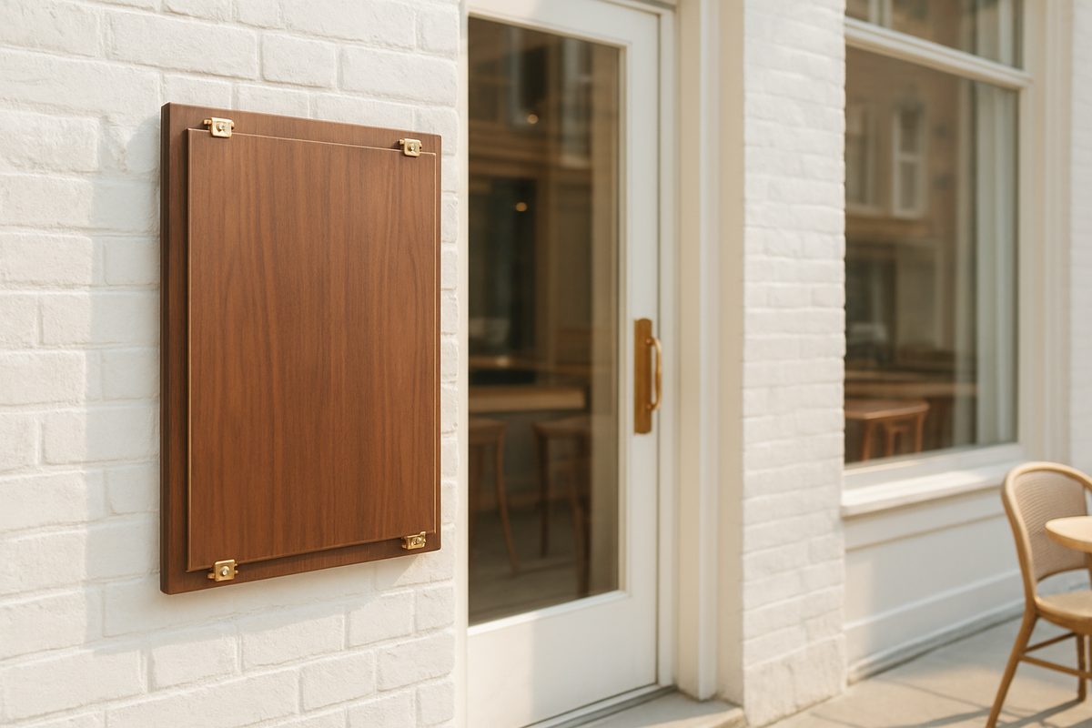
A main street restaurant or cafe competes with every other storefront on the same block. A clear, well-maintained set of restaurant menu boards changes how a customer enters, orders, and spends. It works at two separate moments. The first is at the door, where passersby decide whether to stop. The second is inside, where guests are already committed but still deciding what to buy. The same menu board system does not always serve both moments well, so placement, materials, layout, and upkeep need to be treated as one operating system.
The Door Board Is a Filter, Not a Full Menu
At the curb, the board should answer one thing fast: whether this is the kind of place a customer wants to try. Sidewalk traffic moves in short glances. A board loaded with every item forces work. A door board works better when it shows a limited set. That can be the lunch special, three best sellers, a coffee and pastry pairing, or one seasonal dish. It does not need to reproduce the full menu. That is what the inside board or printed menu handles.
Placement matters before design. Set the board where people naturally pause. That spot is usually near the door handle, beside a window, or just outside the entrance if the district allows it. Keep it out of the path of a swinging door and clear of cafe tables. If the board sits on the sidewalk, weight it or anchor it. A gust of wind can turn a light board into a hazard, and a damaged board outside sends the wrong message before anyone reads it.
Lighting is part of placement. Evening hours change everything. A board that works at noon can disappear at dusk. If the storefront has a nearby lamp or window wash, angle the board toward that light. For covered doorways, a small battery light or a reflective surface can help. Do not depend on chalk lettering alone to carry the message in low light.

Match the Inside Board to the Ordering Moment
Inside, the board becomes a working tool. Customers standing at the counter need a different level of detail than people passing on the sidewalk. The inside board can list categories, modifiers, sizes, and prices clearly. It should follow the order of conversation a cashier would have: drinks first, then food, then add-ons, then sweets. If the board follows the same sequence as the order flow, fewer customers ask questions that slow the line.
Height and angle matter inside too. The board should be readable from a few steps back, not only from directly under it. Ceiling-hung boards can work in tall spaces, but they are hard to update. Wall-mounted boards at eye level are easier for daily changes. Leave enough space between the menu and the counter so a line of three or four people can still read it without leaning over the person in front.
Materials That Survive a Main Street Storefront
Independent operators usually balance cost against durability. The best material is the one the team will actually update, not the one that looks best in a photo. A board that is hard to clean or requires special tools will quickly become stale.
Wood and painted MDF
Wood boards feel warm and fit many independent cafes. They hold paint and vinyl well. They are heavier, which helps outside. The tradeoff is moisture. Unsealed edges can swell in rain or humidity. A sealed or marine-grade board costs more upfront but lasts longer over a main street year.
Chalkboard and dry-erase surfaces
Chalkboard panels are easy to update and inexpensive to change. They suit daily specials and short menus. The quality of the first paint coat matters. A cheap chalkboard surface becomes ghosted after repeated erasing, and the lettering turns muddy. Dry-erase is faster but less attractive for front-facing work. It can read as temporary if the board faces the street.
Acrylic and metal
Clear acrylic covers protect paper inserts from weather and fingerprints. Metal frames add rigidity. This is useful for a menu that changes weekly or monthly, because the insert can be printed at the shop or home and swapped in minutes. The downside is glare. Position acrylic carefully near windows and lights, or use a matte finish.
Digital boards
Digital menu boards make updates instant and can rotate items by time of day. They also require power, software, and a plan for outages. For many small main street shops, a tablet or mounted screen behind the counter is enough. A full outdoor digital board is a larger investment and should be considered only if the menu changes several times a day or the storefront has no other visual anchor.
Layout Rules That Keep the Line Moving
A good board follows a reading pattern. Most customers scan top to bottom and left to right. Do not fight that pattern. Put the most profitable or most popular items where the eye lands first. Use consistent type sizes for categories and prices. Align prices in a clean column instead of scattering them after every description. White space is not wasted space; it separates one choice from the next.
- Group items by category: drinks, mains, sides, and sweets.
- Keep prices aligned to the right or directly after the item, never between words.
- Use no more than two typefaces, and keep one for section headers.
- Show specials on a separate panel or color rather than mixing them into the regular list.
- Leave blank space around the edges so the board does not look stuffed.
- Test readability from the same distance a customer stands when ordering.
The same logic that applies to restaurant menu boards at the curb should follow customers inside. A cluttered board creates the same hesitation at the counter as it does on the sidewalk, and hesitation shortens orders.
Common Mistakes That Undermine a Good Board
Most menu board failures are not design failures. They are operation failures that compound over a month. The most common mistake is a board that has not changed since the season changed. Customers notice the same soup listed in June and assume the kitchen is not paying attention.
Another mistake is writing for the owner, not the customer. A board full of internal shorthand may be clear to staff but not to a first-time visitor. Use names people actually say when they order. Keep abbreviations for the printed ticket, not the customer-facing board.
Poor contrast is also common. Dark letters on dark wood, cream letters on pale yellow, or small type under warm bulbs all disappear. The board should pass a quick squint test. If you can read it comfortably from the back of the line, it works. If you have to step closer, it does not.

A Weekly Update Routine That Actually Happens
A board is only useful if it matches what the kitchen can actually serve. Set one day a week for menu board updates, and attach it to an existing routine like inventory or order day. Fifteen minutes is often enough to erase old items, check spelling, and confirm that the listed dishes are still available.
Keep a small kit near the board: chalk or markers, a cloth, cleaner, a level, and spare fasteners. When the kit lives in the office, updates become a project. When it sits in a drawer near the door, they become a quick correction.
Cleaning matters as much as lettering. Chalk dust, fingerprints, and smudges make even a good layout look neglected. Wipe the board between changes. For covered surfaces, check for condensation inside the cover. For wood boards, reseal edges at the start of wet weather.
Use a simple content review each week. Check that the board matches the dishes you want to sell, that it matches what the kitchen is low on, and that a first-time visitor would understand every word. Fix any gap before adding new items.
Menu Board Positions That Raise the Check Without a Script
Menu boards can guide larger orders without turning the counter into a sales pitch. The board does the suggesting, so staff do not have to repeat upsell lines. A few quiet placements can shift the average ticket.
- Put a regular plus side price next to the standalone item so the better value is obvious.
- Show a small staff pick badge or colored dot on two high-margin items.
- List add-ons in a separate line directly under the main category: extra shot, extra cheese, house sauce.
- Rotate one dessert or pastry to the top of the board each day instead of burying it at the bottom.
- Use a separate card for the daily special where customers are already pausing at the register.
These placements work only if staff can deliver the items quickly and consistently. A board that promotes a sold-out special trains customers to stop trusting the menu.
Treat the Door and Inside Boards as One System
The outside board promises. The inside board confirms. When they conflict, customers notice. If the door board lists a bakery case item that is not on the inside board, or the inside board shows a lower price than the sidewalk card, the experience feels sloppy. Use the same category names, same prices, and the same specials in both places. A daily or weekly photo of both boards can catch mismatches faster than a written checklist.
Think about the full customer path. A person sees the outside board from the sidewalk, steps inside, scans the wall behind the counter, and orders. Each board should hand off to the next. The door board narrows the choices. The inside board expands them with detail. The register conversation confirms the order. When that handoff is clean, the line moves and the shop feels run with care.
The goal is not a perfect-looking board. It is a board system that a small team can keep current, readable, and true to the menu. On a main street, that consistency becomes part of the shop’s reputation before a single plate leaves the kitchen.